MTG Proxy Glow-Up: 10 Cards That Deserve Better Art
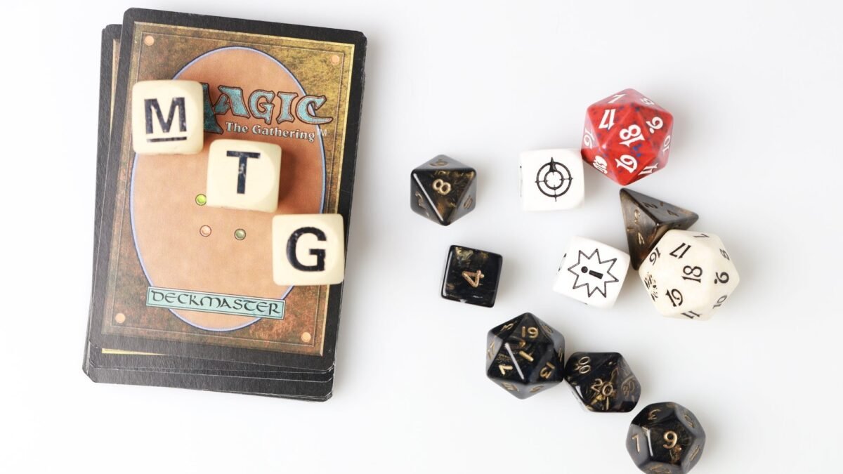
Table of Contents
TLDR
- If you cast a card every game, it deserves art you actually like. That is the whole argument.
- Use the mini prompt template below, grab high-res art, then make your version in the PrintMTG Card Maker.
- Keep the art simple, readable, and high-contrast. Your printer cannot “enhance” a 480px JPEG rumor into crisp cardboard glory.
- This list is mostly Commander staples because Commander players love two things: self-expression and drawing too many cards.
The problem with “fine” art
Some MTG art is iconic. Some is gorgeous. And some is… technically present on the card.
A lot of staples fall into the third category. They do their job, they win games, they show up constantly, and their visuals are either (1) forgettable, or (2) locked into a vibe that does not match your deck at all. That’s where an MTG proxy glow-up is perfect. You keep the rules text you know, but the art finally matches your commander’s aesthetic, your cube theme, or your personal brand of chaos.
MTG proxy glow-up rules
Here’s the simple framework I use so custom art looks good on an actual printed card:
- One clear subject. Tiny silhouettes disappear on cardstock. Big shapes read better.
- High contrast. If your art is all misty midtones, it will print like a sad postcard.
- Leave space for the frame. The art can be wild. The layout still needs to breathe.
- Start with enough pixels. If you want it crisp in hand, don’t start with an image that looks like it was downloaded through dial-up.
Mini prompt formula (copy/paste)
Subject + setting + mood + medium/style + color palette + composition cue
Example: “ancient artifact ring trapping starlight, ruined observatory, awe and mystery, high fantasy illustration, gold and teal palette, centered composition, dramatic lighting”
10 cards that deserve better art (with mini design prompts)
1) Sol Ring
Sol Ring is the most-played “I’m just ramping” card ever printed. Which is funny, because half the time the art looks like a nice trinket you’d find in a museum gift shop.
Glow-up direction: make it feel like a dangerous relic, not a tasteful paperweight.
Mini prompt: “mythic ring capturing a star, floating above ancient stone altar, high fantasy illustration, radiant gold light, deep shadows, centered composition”
Card Maker tip: go Full Art if you want it to feel like a trophy. Keep bright highlights away from the rules box area.
2) Command Tower
Command Tower is a perfect candidate for personalization because “a tower” can be literally anything: cathedral, space station, haunted lighthouse, goblin scrapyard… you get the idea.
Glow-up direction: match your commander’s plane, faction, or vibe.
Mini prompt: “tower that embodies leadership and power, stormy sky, epic scale, cinematic fantasy matte painting, strong silhouette, dramatic lighting”
Card Maker tip: if your deck has a tight theme, make all your lands share a palette. It makes the whole deck feel intentional.
3) Arcane Signet
Arcane Signet is the definition of a functional staple. It’s also the definition of art you stop noticing after the third game.
Glow-up direction: turn it into your commander’s “signature symbol.”
Mini prompt: “ornate magical signet shaped like a sigil, hovering in a circle of runes, arcane workshop, luminous ink, crisp linework, high contrast”
Card Maker tip: artifacts love clean shapes. Avoid overly busy backgrounds unless you want “muddy gray blob” energy.
4) Rhystic Study
Rhystic Study has one of the loudest table presences in Commander, but the art often feels like “someone is reading.” Which is accurate, but not exactly legendary.
Glow-up direction: lean into the vibe: bureaucracy, tax audits, cosmic knowledge, or petty wizard paperwork.
Mini prompt: “wizard filing endless magical paperwork, floating scrolls, candlelit library, sarcastic mood, detailed illustration, cool blue shadows, warm gold highlights”
Card Maker tip: if you want humor, keep it readable at thumbnail size. Big facial expression, big prop, simple background.
5) Mystic Remora
Mystic Remora is either an adorable little leech-fish friend or a predatory nightmare depending on your table’s opinion. The art can go way harder.
Glow-up direction: make it feel like a lurking ocean omen, not a mildly confused fish.
Mini prompt: “spectral remora circling a glowing spellbook, deep sea trench, eerie bioluminescence, painterly fantasy, teal and violet palette, strong focal point”
Card Maker tip: bioluminescent palettes print beautifully if the darks are truly dark. Don’t be afraid of shadows.
6) Smothering Tithe
Smothering Tithe is basically “congrats on drawing cards, now pay your taxes.” The art can be much funnier, much darker, or both.
Glow-up direction: fantasy IRS, angelic tax collectors, or a literal avalanche of coins.
Mini prompt: “angelic bureaucrats collecting coins from stunned adventurers, towering ledger book, ornate cathedral office, dramatic lighting, rich gold palette, sharp detail”
Card Maker tip: treasure and gold can blow out highlights. Keep some texture in the bright areas so it doesn’t print flat.
7) Dockside Extortionist
Dockside is already fun, but you can push it into full heist movie territory. Make it feel like a master criminal, not just a guy who found your artifacts and got ideas.
Glow-up direction: fantasy Oceans Eleven, dockyard pickpocket legend, treasure-hunting gremlin energy.
Mini prompt: “goblin pirate mastermind mid-heist, moonlit docks, stolen jewels and artifacts, cinematic composition, warm lantern light, mischievous expression”
Card Maker tip: reds can print a little heavy if the art is dark. Give it some warm highlights so it stays lively.
8) Cyclonic Rift
Cyclonic Rift is a whole moment. It’s not a “minor inconvenience.” It’s a natural disaster you cast on purpose. The art should look like the world is ending (politely, at instant speed).
Glow-up direction: a colossal vortex swallowing a battlefield, or a reality tear with surreal geometry.
Mini prompt: “massive magical cyclone tearing reality, battlefield debris spiraling upward, epic scale, stormy blues, lightning, dynamic motion, high drama”
Card Maker tip: motion blur looks cool, but too much makes printing look soft. Keep at least one crisp focal area.
9) Demonic Tutor
Tutors are peak “powerful effect, simple action.” Demonic Tutor can be anything from elegant occult symbolism to a full horror scene. Just maybe don’t make it look like a stock photo of a handshake.
Glow-up direction: contracts, sigils, candlelit rituals, “this is definitely a bad idea” energy.
Mini prompt: “ominous demon offering a contract across a candlelit table, arcane sigils glowing, gothic atmosphere, high fantasy illustration, deep blacks, red accents”
Card Maker tip: black-heavy art prints great when it has texture. Flat black becomes flat cardboard.
10) Aetherflux Reservoir
Aetherflux Reservoir is an absurd card. You gain life, you gain more life, then you fire a laser that deletes someone. The art should match the comedy and the menace.
Glow-up direction: aether-powered death ray, steampunk superweapon, or sleek sci-fi cannon.
Mini prompt: “massive energy reservoir weapon charging, glowing coils, aether streams, sci-fi artifact lab, dramatic lighting, crisp detail, strong perspective”
Card Maker tip: bright glow effects look best when you keep the surrounding environment darker. Let the glow do the work.
Make your version in the Card Maker
Once you’ve got art you like, the fastest path is: build the card in the Card Maker, preview it, then print your deck.
- Start here: MTG Card Maker on PrintMTG
- If your art looks soft, crunchy, or suspiciously low-res, read this first: MTG Proxy Image Prep
And yes, if you order prints from us, we’re doing the premium stuff behind the scenes: clean print, UV-coated finish, consistent cutting, and image enhancement so your glow-up doesn’t turn into “glow-down” the moment it hits cardstock.
FAQs
Do I need to change the card’s text when I change the art?
No. The whole point is “new look, same card.” Keep the name and rules text consistent so nobody has to squint-read your deck like it’s a museum placard.
What resolution should my custom art be for printing?
Bigger is better, but as a baseline you want enough pixels to look crisp at card size. If you start small, it will print small, and not in a cute way.
Should I use full-art for everything?
Not everything. Full-art is great for splashy staples and lands. For busy scenes, a standard frame can actually improve readability.
How do I make a whole deck look cohesive?
Pick one theme rule and stick to it: shared palette, shared art style (oil paint, stained glass, comic), or shared motif (runes, celestial, noir). Consistency beats “random cool images” nine times out of ten.